Which watercolour paints should I buy?
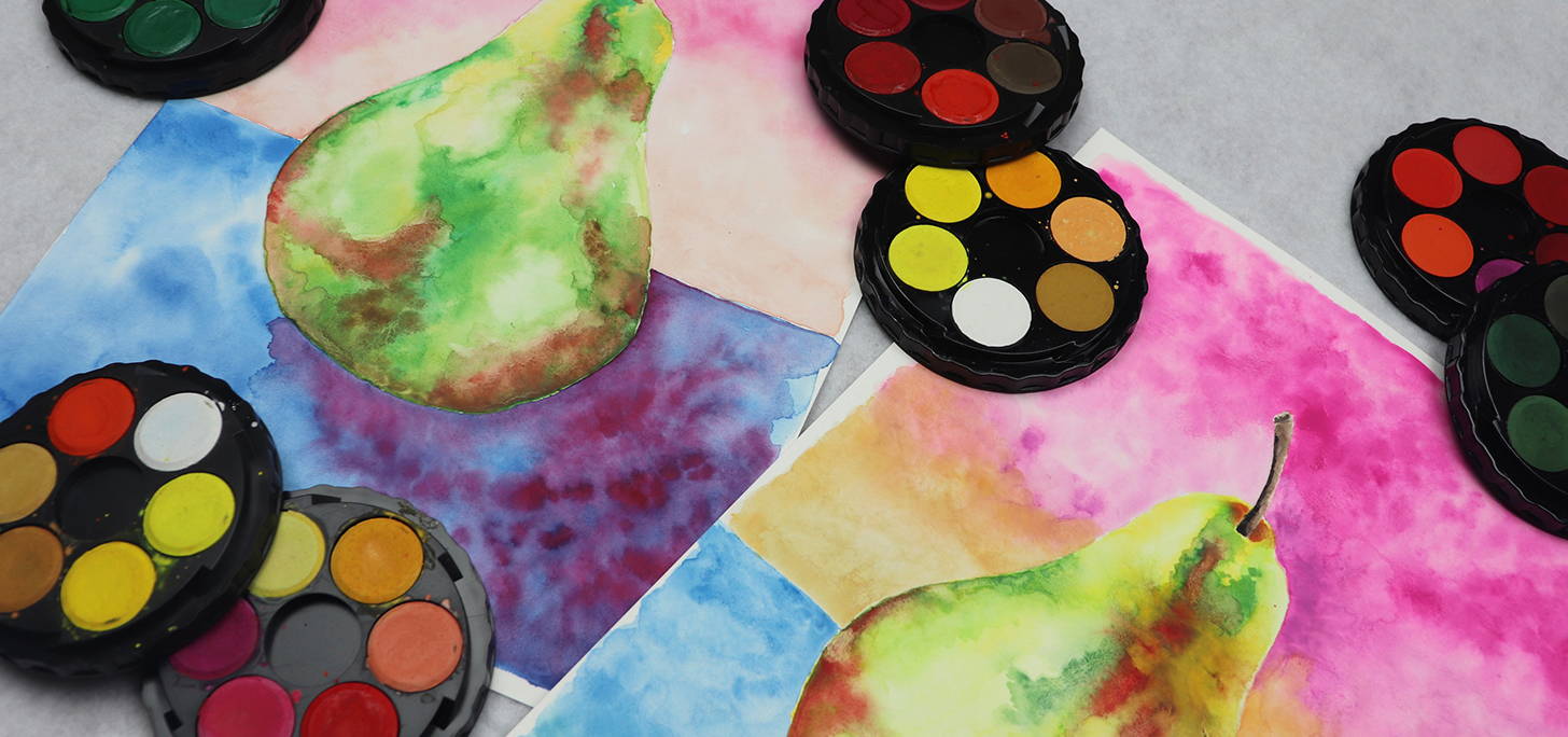
Compare the Pear is where Mrs Red takes similar art brands, does individual pear drawings or paintings, using the brands individually and then comparing the differences! None of the brands have been given to Mrs Red by a Supplier or Brand, so the comparison is honest and aimed to help you make decisions about which brand to go with.
Compare the Pear - Watercolour Disc Sets
This Compare the Pear challenge will see two different brands of watercolour paint discs go up against each other to help you decide which watercolour paints are best for you to use for painting with, no matter what stage you are at in your creative journey.
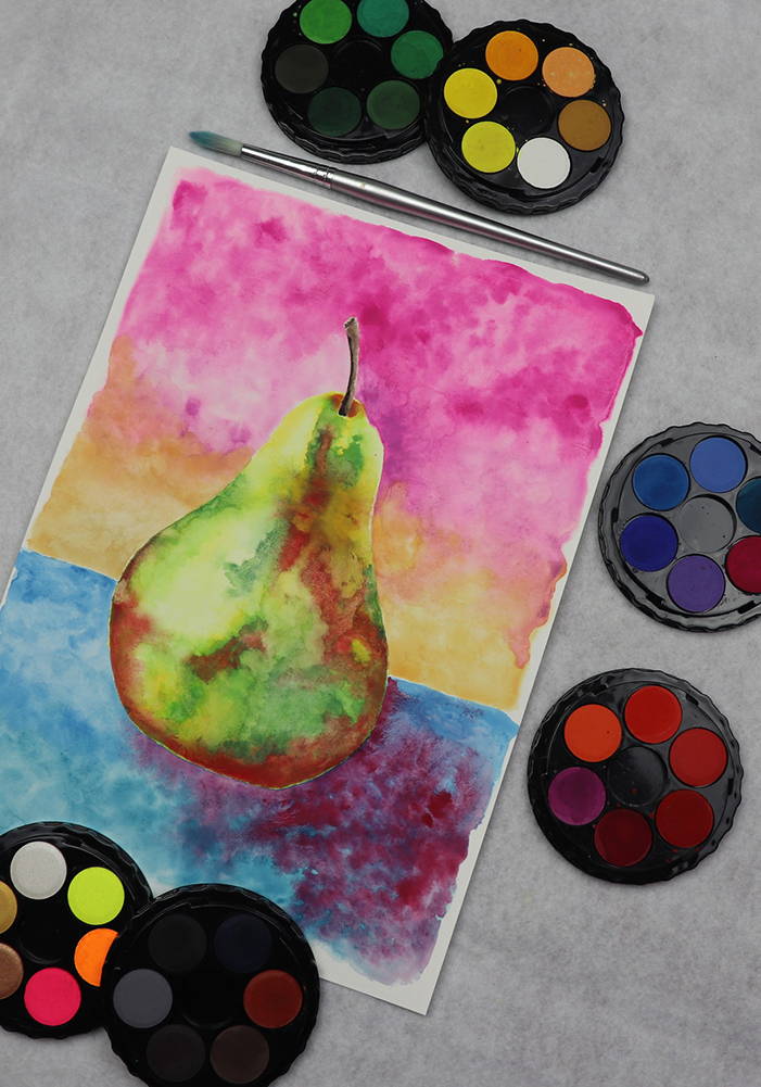
The intention behind Compare the Pear is to compare the products and how they perform under a similar test. For this test I have used the 36 colour set in each brand. I have done my best to paint the pears in similar watercolours so that the paintings at least look similar.
Which watercolour disc sets are being put to the test?
And as for the paper and brush...
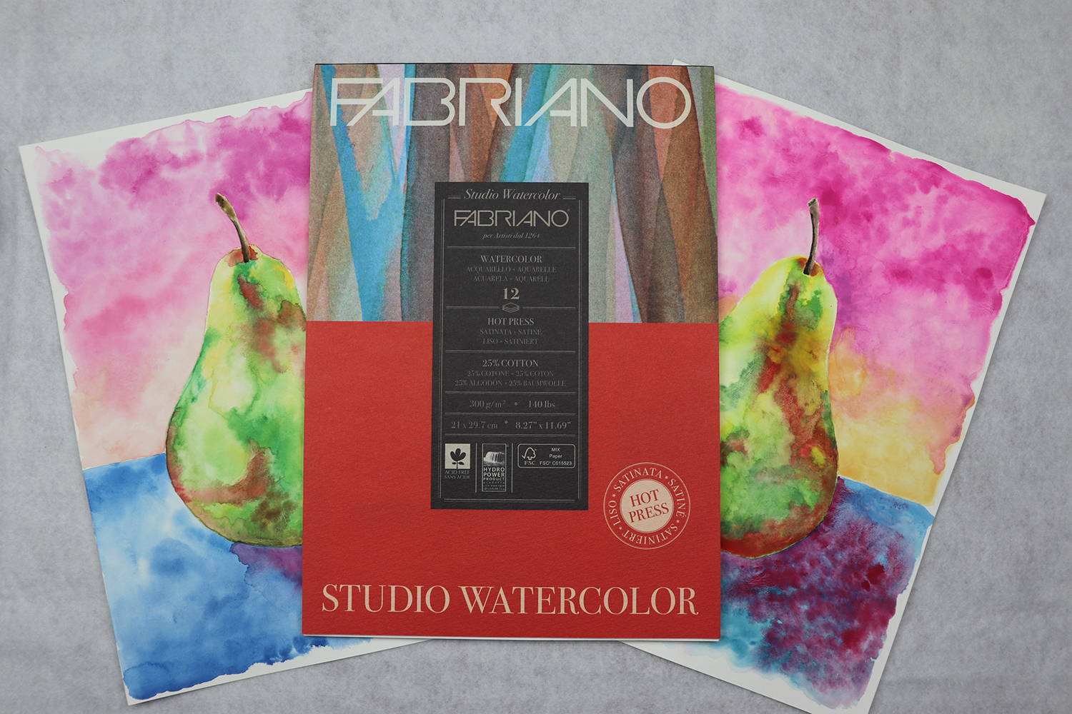
The paper that has been used both watercolour paintings is Fabriano Studio Watercolor, which guarantees an exceptional quality for students and beginners. Mrs Red stocks this paper in both cool (rough) and hot (smooth) pressed, in weights of 200, 275 and 300gsm. It’s ideal for watercolour, acrylic, gouache, ink and drawing.
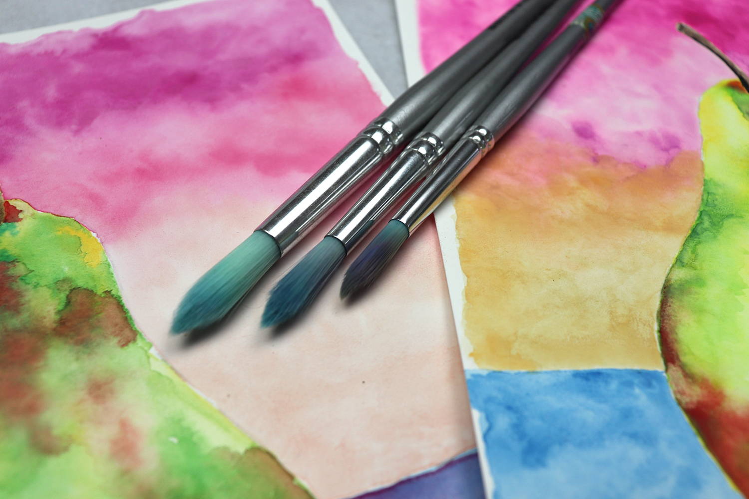
I have used the Jasart Taklon Round brush, size 8 for this painting. There are Mrs Red’s favourite watercolour brushes as they are so soft, hold heaps of water and never fray. The example image is paint brushes that have been used in my Wine & Untangle classes for 4 years and many students using them. Look at the range here [link to brushes]
How Watercolours Perform
What I am mainly looking for in comparing the two different watercolour discs, was how well a colour would absorb into a wet brush, how well it sat on surface of paper and how much granulation would occur, if any. Granulation occurs when the pigment particles form together rather than evenly settle on the painted surface.
As you will see in the YouTube video (link further down), I only work on one watercolour painting at a time but used as close to the same colours in the same order for the second pear, to make the comparison easier.
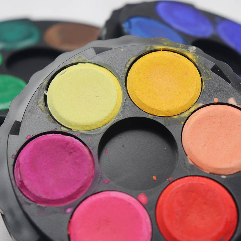
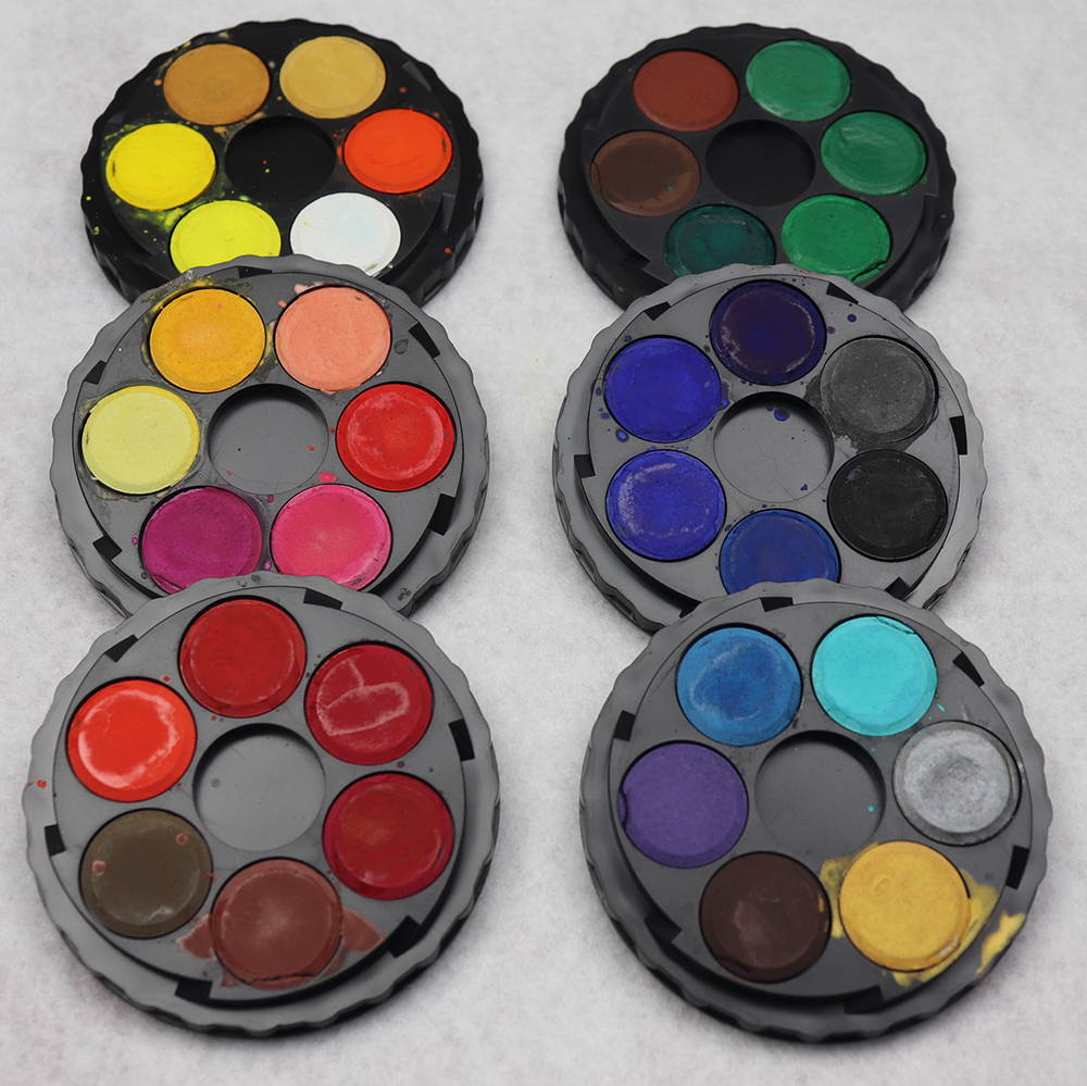
Koh-I-Noor Watercolours
First glance looks like a nice range of colours. There is a small skin tone range, variety of warm colours but lacking a real purple in the cool colours. One whole disc (6 colours) is metallic. I did not use metallic in the test however I have used them on other paintings, and they offer a mild shimmer.
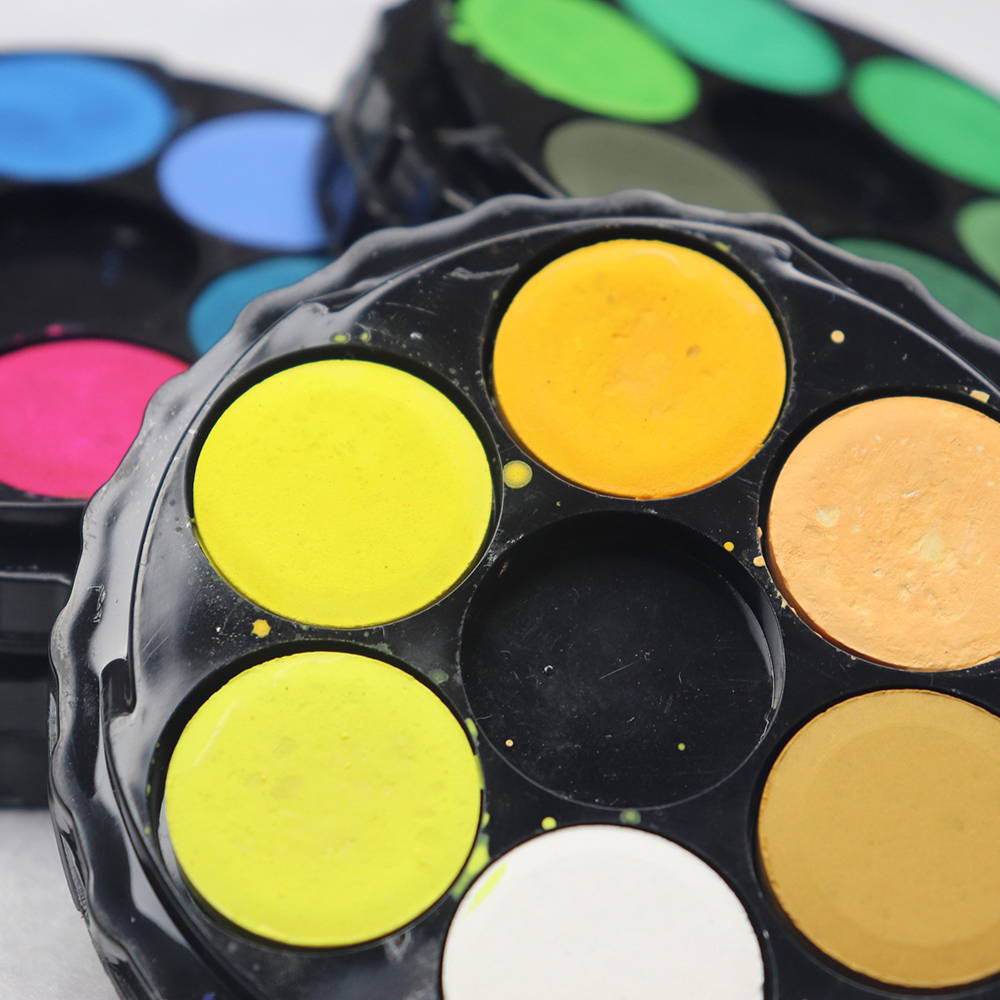
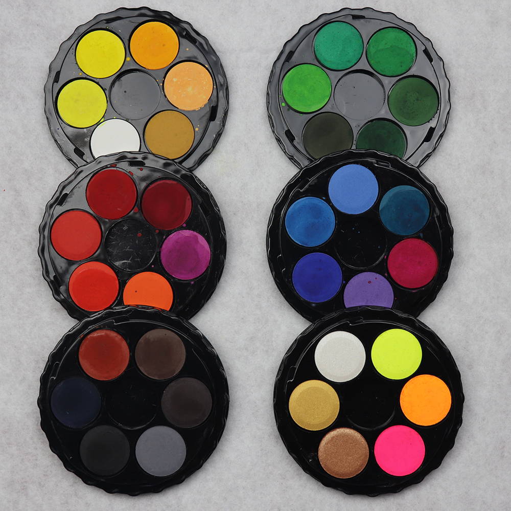
Jasart Voyager Watercolours
Again, first glance looks like a nice colour range. Not really a skin option but has more of a earthy mix. The range of cool and warm colours look well balanced, although there is one disc with six different shades of green. They too have one disc dedicated to a different mix, this time being 3 metallics and 3 fluro’s, which is kind of a nice surprise.
So, let’s wet our brushes and find out which watercolour disc sets are best for you!
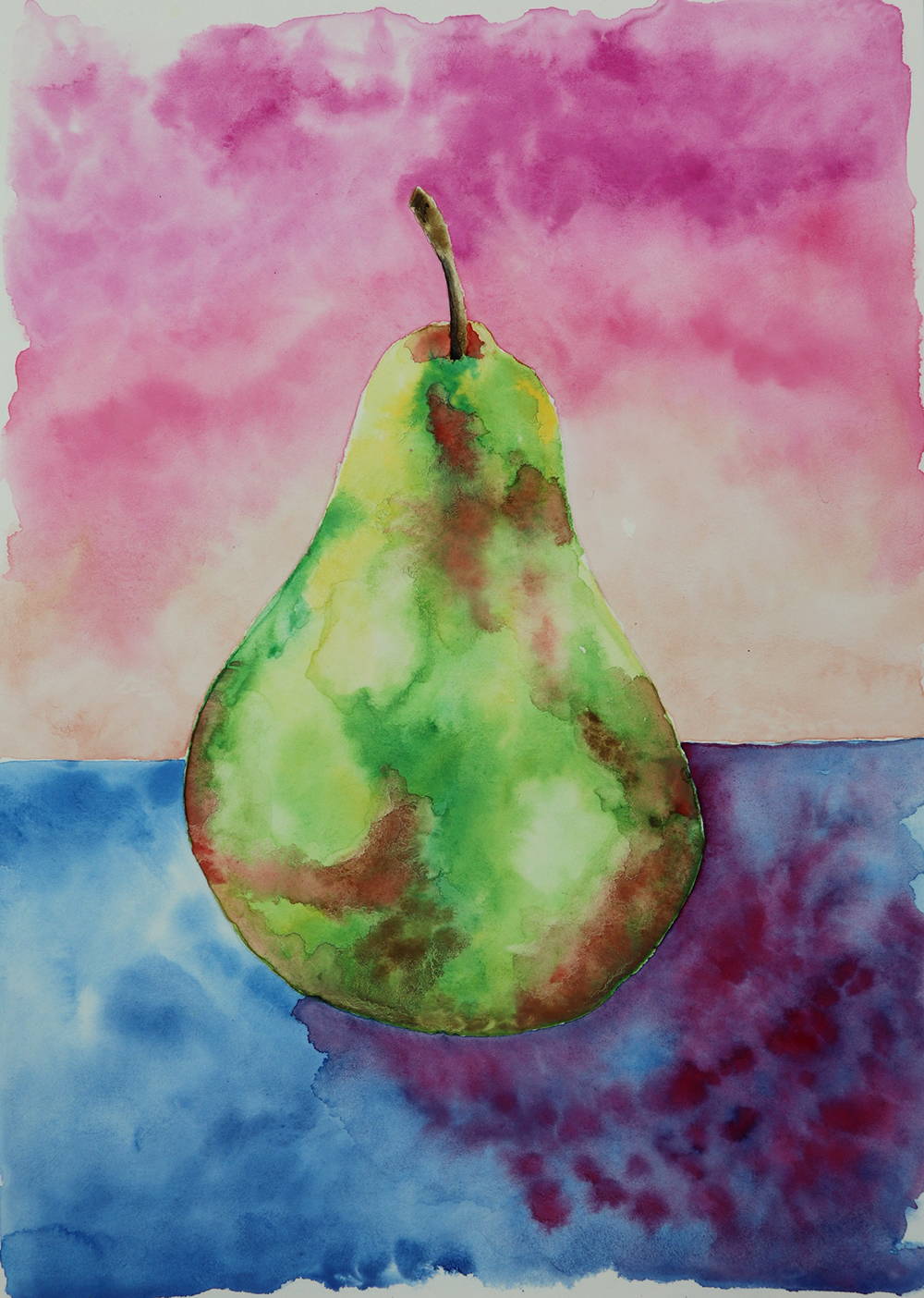
Koh-I-Noor
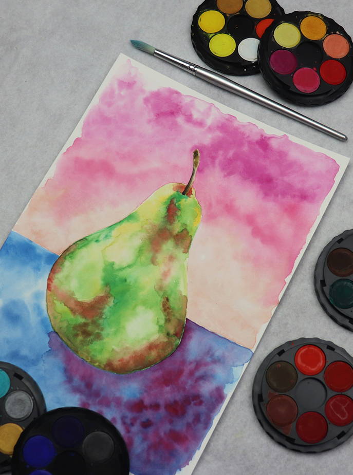
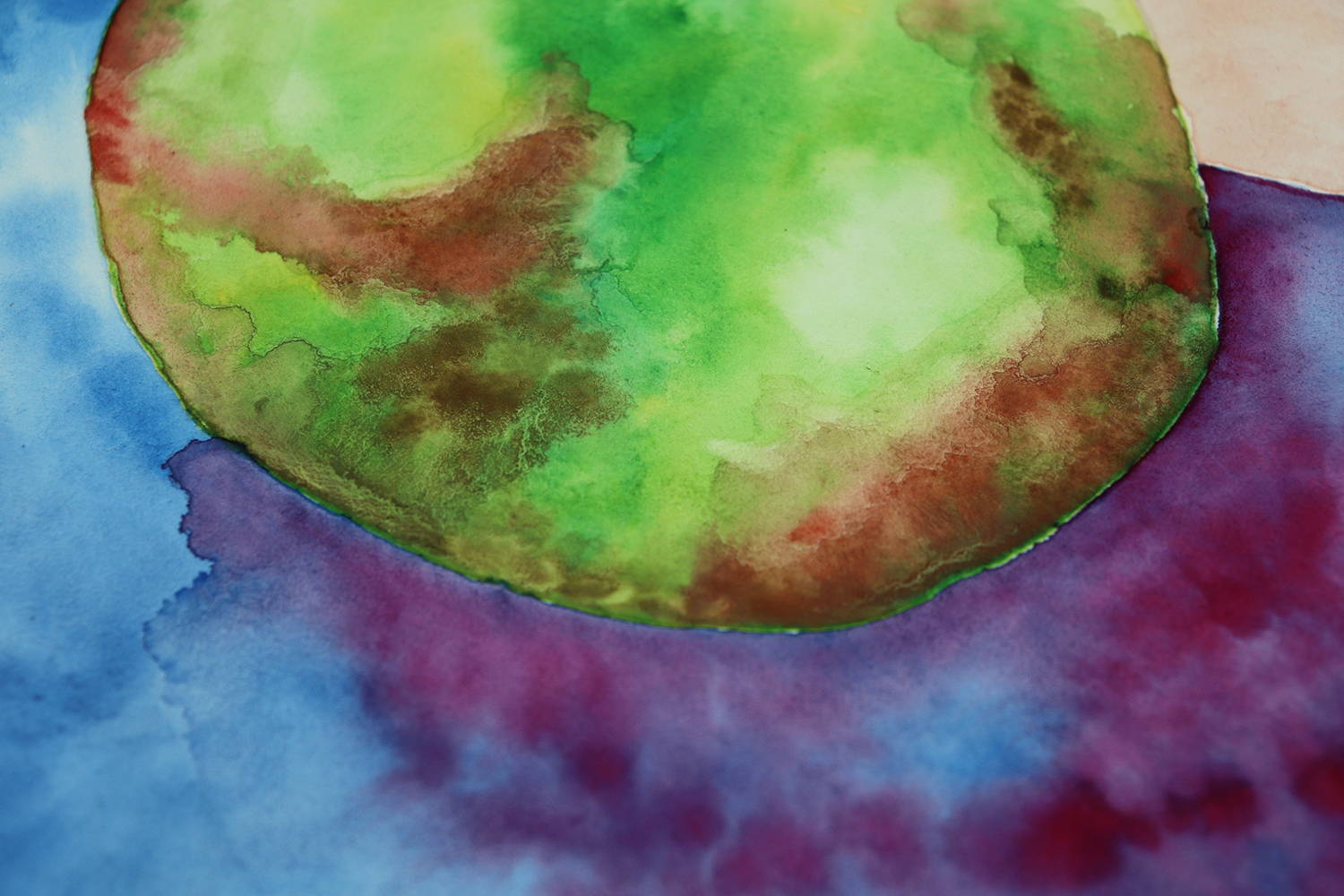
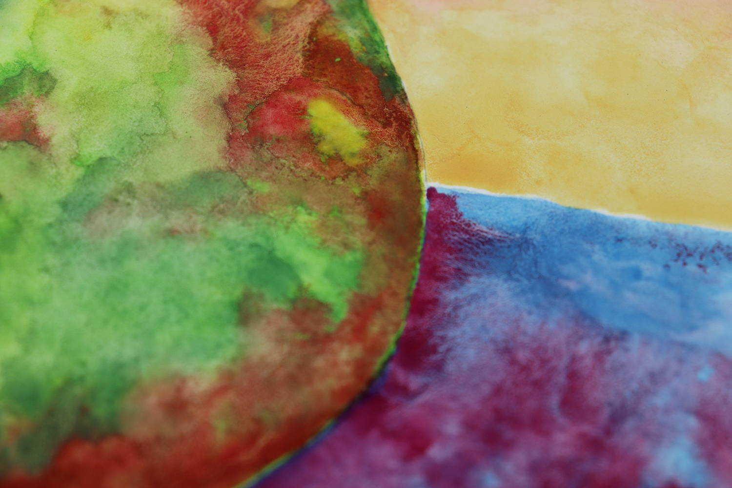
As you will see in the YouTube video, I start most watercolour paintings by applying a layer of water to the object I’m painting on the paper first. I then put the wet brush into the disc colour I want to use and the colour lifted easily into the brush, loading it with vibrant colour. Applying the loaded brush to the wet paper was also a smooth and easy transition with colour spreading easily. I start blending colours by adding the next layer to an already wet surface and it was only when I got to a layer of brown that I noticed the granulation occur. And to my knowledge, it was only the browns that granulate. I then added red to the green (as red and green make brown) and this stopped the granulation.
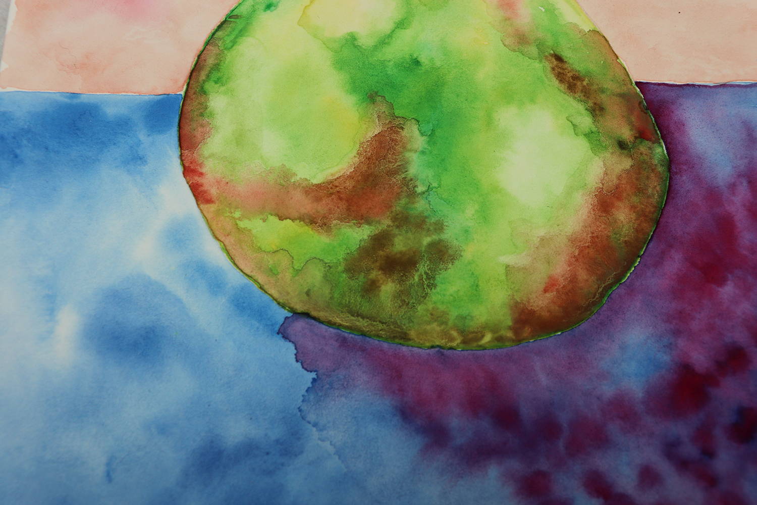
The idea behind the background was to test 2 or 3 colours from same colour range and see the difference. The two blues I chose which were opposite each other on the disc ended up being way too similar and it really doesn’t look like I painted with two different blues at all.
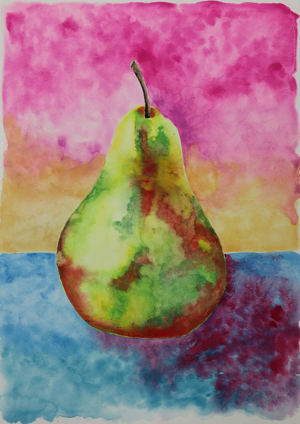
Jasart Voyager
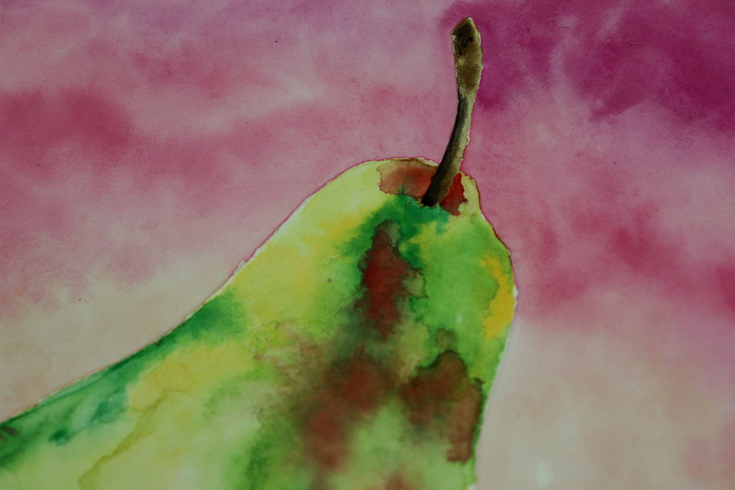
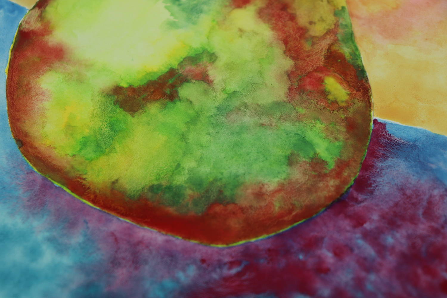
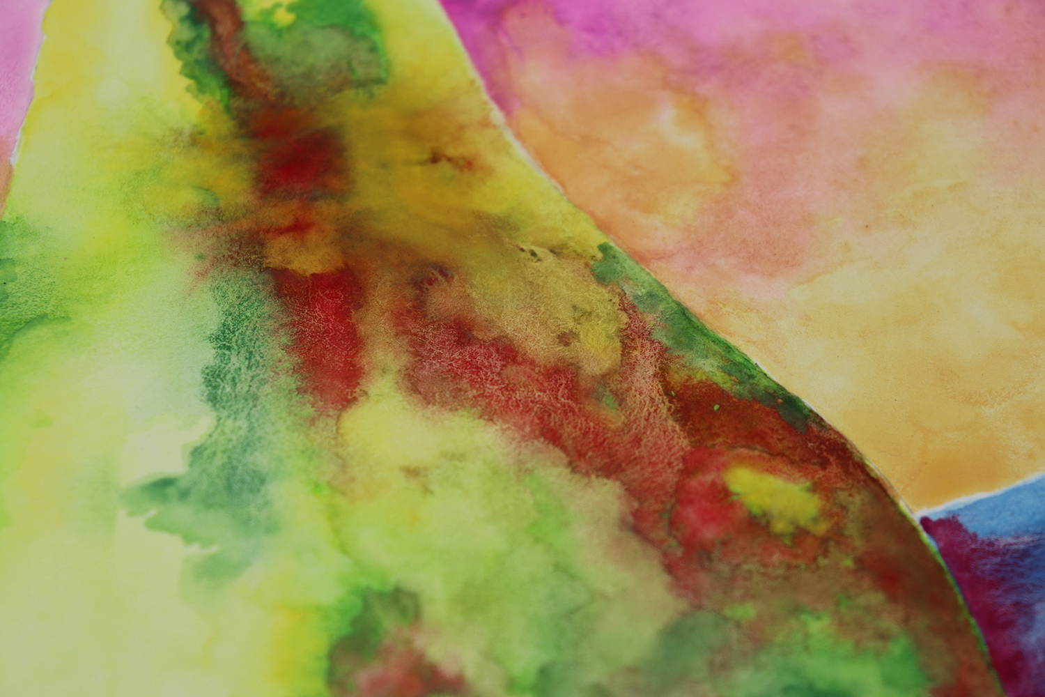
Again, I start with painting clean water into the pear. The colours all load into a wet brush nicely and lay down well onto the wet paper. The choice for a light yellow wasn’t available so I just kept a very watery first layer. Granulation started occurring with the darker of the two greens used and then continued with the brown, red and pink. It made it a little more time consuming spreading the granulated areas out to make it a little smoother.
This time however, you can tell I have used 2 different blues for the background, and they blended nicely together with barley any granulation occurring. The red I added did granulate however it really sat on top of the blue and never lost its vibrancy, even after drying. You can see I have used 3 colours in top of background but there was granulation happening, especially with the bright pink at the top.
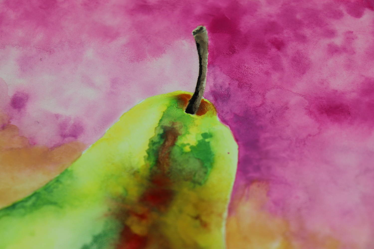
If you look at the left-hand side of the pear, right where the blue and peach background colours meet, there looks to be a little leak of peach colour in the pear. This is not the case though. I accidently put water on the pear when I was painting in the horizon line and if left wet the blue would have run into it. I dabbed it dry with paper towel and it lifted a layer of colour off the pear.
Once dry the colours kept their vibrancy but there as not as many watercolour lines as the Koh-I-Noor pear. That’s not a bad thing, more personal, I like having watercolour lines appearing in my paintings.
One thing to note if you are using these watercolour discs paints with other art supplies, such as doodling over the top of them like I did. The black pens worked nicely over the top, however when the paint has dried, if you glide your hand gently over the finished painting you will notice quite a rough texture. If you are doodling or using pencils over the top of the painted surface, you need to have a clean piece of paper to rest the side of your hand on. I found out the hard way by smudging and moving colour around the page.
Conclusion of the comparisons
Both brands performed really well and I will use both brands again in future artworks.
Price wise, if you are buying them for students and beginners’, budget may determine your choice and you would lean towards the Jasart Voyager. You are getting three fun fluro colours with them as well.
If you want the painting to look like a watercolour painting, then you might lean more towards the Koh-I-Noor for those lovely water lines.
Granulation was very obvious in the Jasart Voyager paints however some people love this effect.
Vibrancy wise, Jasart Voyager was an obvious choice. I’m not sure if the photo images show it as well as seeing it in person but the Jasart Voyager is definitely got a vibrancy that the Koh-I-Noor lacks.
For my own purposes, I have gone with the Koh-I-Noor because I am selling them to people who are doing my monthly Wine & Untangles (online Paint’n’Sip events) and I don’t want them to have granulation issues and those yummy water lines can sometime be an advantage when doodling. Saying that, for a mixed media artwork that was vibrant and granulation wasn't an issue or it added to the artwork I would choose the Jasart Voyager.
As for you, ask yourself the following questions when buying a set of watercolour paints. What are you buying the paints for? Who will be using them? What is your budget? Both sets of discs will last a long long time, as will the Jasart brushes.
In regard to whether fading will occur (called ‘light fast’) the Jasart Voyager doesn’t mention it and the Koh-I-Noor says they are, but I would make your own opinion on this. They are student grade paints and if you are buying more paints because you are getting through them then I would lean towards the professional watercolour paints, preferably in a tube as well. Bare this in mind if you are wanting to sell your watercolour paintings or if you want to purchase an artists painting. Ask the artist, what brand of paint they are using? No one wants to pay good money for a painting that starts to fade on them in a few years’ time.
Koh-I-Noor Watercolours
Jasart Voyager Watercolours
Mrs Red’s online art supply store stocks both of these brands plus others. Take a look at the range here [put painting link in]. And if you would like more info and to join in on the monthly Wine & Untangle, please click on this link [W&U link]
And please enjoy watching the YouTube video below, to watch the individual pear paintings come together. If you have any questions, please comment below and if you have a suggestion for Compare the Pear, please let me know via create@mrsreds.com.au as I would love to compare art materials that you want compared.
Happy painting!
Mrs Red
x